


Online visual strategies for Ampersand Design
Ampersand is a digital design studio. Their expertise is in rendering well-researched and unique end-to-end solutions that often take the shape of – but are not limited to – apps, websites, exhibitions, branding and publications. Their clients span across industries and scale, from large insurance companies to small retail firms. They work with flexibility across all domains. Their design philosophy is to be user-centric, simple & elegant. They focus on delivering a seamless user experience to embody their belief that technology can and should be an extension of the self. Ampersand is a part of Techequity Technologies Pvt Ltd and operates under it as its legal entity.
Art direction - Vikram Aditiya Sharma
Design - Somanshu kumar patel
“There are certain images you associate with the brand, by looking at their body of work, and that’s how you perceive their branding.”
Ampersand Design has its roots in the traditional graphic design systems. Their use of grids, plans, functions, codes and concept is very distinct. As a brand, Ampersand is very young, fresh and abstract. It is very experimental and playful in nature. Their existing visual language does not do justice to their strong beliefs and philosophies. The redesigned visual system should have a concept which reflects on Ampersand’s mature personality and character as well.
This project involves designing a visual language for Ampersand Design. The design system employed must deliver an equal balance of concept and aesthetics. The visual language will be reflected on multiple domains. Potential domains being website, pitch deck, brand stationary, Interiors and Promotion on
different Platforms.
Introduction
+
Scope of Work
+
Understanding User Story
Studying the Ampersand team through interactions at formal and informal levels and reviewing their portfolio. This will help me understand the studio dynamics, practices and environment.
Data Collection and Analysis
Studying their existing website and analysing it on the basis of
Information, Interface and Interaction.
Conceptualising
Analysing the content and brainstorming for concepts that deliver meaning and the perception desired. At this stage, the student will be constantly sketching Journey Maps, and figuring out UX for each concept derived. Moodboards will also be made to study existing platforms that
inspire Ampersand.
Mapping
This stage requires the student to construct Site Maps and User Flows (Detailed Site Map) after clearing the Information Architecture.
Wireframe and Annotations
Defining information hierarchy and layouts according to how the user is to process the information. This
is basically the foundation of the Visual Design and Annotations (written notes on how wireframes work). It is useful in order to understand how each page looks and functions.
Visual Design
Defining the identity of the product. The student will be structuring and defining the UI. At this stage the student will be exploring with color, typography and other graphic elements.
Comps Pixel Perfect Renders
At this stage the student will be making mock ups based on margins, grids and content sizes. This will help in creating a uniformity throughout
the framework.
Redlines
Creating a spec sheet of the UX design. This includes specifying all graphic elements used in the design - width, height, font, color. This will help developers to recreate the pixel
perfect design.
Curating of Visual Material
Re-documenting all projects into the finalised structured narrative and creating a template for new projects. Documenting the projects would be carried out in the form of photography, mockups etc.
Technical Debt Document
A technical debt document is an annotated review
of the developed product, that points out the design inconsistencies or errors in the product. They help make sure that the end product matches the designs and additionally ensures that the design decisions are feasible.
Promotional Strategy
This would include studying specs, formats and systems of different platforms on social media, which would help in structuring the content for each platform by making a flexible set of guidelines.
Documentation
The entire process will be recorded on a private blog to aid the
process of documentation.
Case Study
+

Before starting the project it was important to analyse our competitors. I dived into various resource and found some good examples/competitors. The web is a space with an endless number of websites, that keep incrementing by the day. Some are extremely well designed, while some are barely legible.
My aim was to study and grasp how navigation on a website works, analyse them on the basis of Information, Interface and Interaction. At the same time, I was looking at how content is structured and the manner in which it comes together visually.
I covered studio websites, e-commerce to hotel bookings, magazines and fashion websites.There are only a handful of websites with a good layout or in the way they present their content, some also have an interesting grid and interaction. I studied a handful of websites that I felt were interesting and helped raise questions and strengthen ideas that would guide my decisions ahead.
This task helped me to imagine Ampersand’s website creating a niche by being more aesthetic, modern, simple and young. The following section focuses on these, with my observations and learnings alongside the time spent understanding various websites over the courses of six months, finding similarities and differences among them, something that taught me the most about web design during the entire course of my project.
The Following pages has the thumbnails of a few websites that I studied during my research.

The Following pages has the thumbnails of a few websites that I studied during my research.

The Following pages has the thumbnails of a few websites that I studied during my research.

The Following pages has the thumbnails of a few websites that I studied during my research.
The Following pages has the thumbnails of a few websites that I studied during my research.


Case Layout study
+
Case Study
+
Layout
One of the Key observations during this study was the stark difference between Older and Newer Websites. Where a studio several years ago would provide for a standard view-port for images and left aligned column for navigation that serves as a basic structure for the entire website, more recently made ones are breaking away from this. As a result of advancing technology, portfolio websites have begun taking advantages of longer scrolls and well documented work. Less clutter on the screen, and more attention to making the website visually appealing and memorable have become an important factor.
Moreover, the phenomenon of the “Responsive” website has heavily influenced web layouts to make content easily re-stackable for varying screen sizes.
Navigation
Navigation on a website can influence how much of a website is seen. Without good navigation that covers the entire site, visitors can get stuck on a page and will not be able to move on to explore more of the site.
Some things that were easy to notice about navigation on recent websites include the incorporation of hidden menus or hamburger menus, as they are known popularly, a feature that is always available to expand on the site. Additionally by making good use of primary navigation, secondary navigation, and internal linking, it is easy to create
a user experience that is likely to keep people interested and loyal, to the site.
Browsing
A key observation after visiting a number of websites was that the vertical scrolling for longer duration of time gained momentum with social media. Also, a lot of websites have distributed their content vertically, some even horizontally. Horizontal browsing within the vertical scroll allows for even more content to be incorporated into a single page, and with the advent of responsive design, these features work well on multiple devices.
Interaction
The use of mini animation when the
user hovers, clicks, loads and scrolls
has made the web experience almost
like a motion graphic of these parallax has picked up the speed, a phenomenon reminiscent of pop-up / pull-out books
in which content and images are
hidden behind layers, only to make
an appearance.
I think a multidisciplinary studio
website should be interaction heavy, cause it adds appeal to the website, creates an impression of being
updated with technology and people
are usually attracted towards interactive elements very easily.
Treatment
Visual treatment of images on the web has been the most noticeable trend on portfolio websites. Studios have focused on documenting their work well, resulting in beautiful high resolution images.
Moreover, images are given more
space to contribute to the look and feel
of the website.
Another significant factor in treatment is Typography on the web. As the concept of ‘web safe’ fonts has now evolved, it includes a wider range of typefaces that can be rendered by browsers and devices. This has seen the better type combinations, and a more liberal treatment of type that contributes equally to the look and feel of a website.
Overall, the use of more white-space and incorporating breathing area has become a key trend, as well as using splashes of bold colour. Making one’s website look the part through the use of brand specific visual language has allowed websites to become integral to the brand itself.
Branding
A website is a vital part of one branding platform, and it’s important to understand that a website isn’t a just a medium for branding, it’s a part of it. Website branding for instance extends beyond having a logo on an unbranded template site. It is an accumulation of all the aspects that have come together in various ways previously in an easy to access format.
From the various studio website case studies, it is easy to see the web space is slowly being used to not only showcase work and itself. Through the visual language, a studio can communicate their style of work to a potential client, as well as serve as a backdrop for the kind of work they have on display
Information Architecture
+
Creating a map of all the information that was to be included on the website was the first step in the design process. Knowing the content that would be worked with would support the explorations that where to follow. Based on an overall understanding of how websites are structured, a lot of time was spent discussing what would be relevant. For the core of the website, four things were made certain of.
Site Map
+
A site map is a model of a website’s content designed to help both users and search engines navigate the site. A site map can be a hierarchical list of pages organized by topic, and subtopic linked to it. It’s an effective planning tool for both designers and non-designers alike. It’s a centralized tool that can help organize and clarify the content that needs to be on a site, as well as help to eliminate unnecessary pages.
The four features discussed were each translated into page on the website. It seemed like a good starting point from which we could build on or edit as time passed. The pros and cons of each could be tackled as we learnt more about what works for the studio. While creating the first site-map, it was important to make sure that the side not have too many layers of information; the minimum number of steps from point A to point B.
The more steps, the more the possibility a visitor has to leave the site without completing what they intended to do or see. The map on the next page illustrates the architecture of information for the first structural prototype. While doing so, a few key points were kept in mind:
Keeping a minimum number of clicks the user needs before they get to their information destination. It should not require more than 3 clicks to find the necessary information and destination.
The navigation tools/bars need to remain present when moving from one web page to the next. Use the site-map to link to all available pages on the website.

Wireframe explorations
+
The wireframe usually lacks typographic style, color, or graphics, since the main focus lies in functionality, behavior, and priority of content. In other words, it focuses on what a screen does, not what it looks like. Wireframes can be pencil drawings or sketches on a whiteboard, or they can be produced by means of
a broad array of free or commercial software applications. Wireframes are generally created by business analysts, user experience designers, developers, visual designers, and by those with expertise in interaction design, information architecture and user research.
Wireframes focus on:
The range of functions available.
The relative priorities of the information and functions.
The rules for displaying certain kinds
of information.
The effect of different scenarios on t
he display.
The use of typography, symbols, color and other static and dynamic graphics are used to convey facts, concepts
and emotions.
This makes up an information-oriented, systematic graphic design, Which helps people understand complex information.
On the facing page is the first draft of wireframe, I used an 8 column grid to make this wire frame. Also I used red color for my wireframe after seeing which Vikram suggested that I change the color of the wire frame. I wanted to use some elements on the grid and some off the grid and wanted to experiment with the layout to make it unique.


Updated Grid & Wireframe
+
A grid is made of lines that allow the ease of locating points. I have learned that the best way to create a design-to-development workflow is through a grid structure because it provides clarity, consistency and efficiency.


Mood Board
+
A Mood Board plays a very important role when it comes to designing, It helps a lot in understanding the brand, the client and what are they aiming for. It is an arrangement of images, materials, pieces of text, etc. which solves the visual implementation for the project. Mood boards evoke or project a particular style or concept. We use mood boards to visually illustrate the style we wish to pursue.
Mood boards are not limited to visual subjects, but serve as a visual tool to quickly inform others of the overall “feel” (or “flow”) of an idea. In creative processes, mood boards can balance co-ordination and creative freedom.
Here I made a mood board for the Ampersand Design Website keeping
in mind the mood of the environment, personification, and the art direction for the website. Another board was prepared for colour, typography, and other elements used for the visual language.


Font Selection
+
For a website, the Typography is quite essential as it helps to set the mood of the work and gives an impression of the qualities of the company, firm or studio. To match up with the values listed down during brainstorming and the qualities of Ampersand, hundreds of typefaces were scanned through to use something unique.
Although serif fonts are being incorporated into digital platforms, I personally feel they look better in a publication as they form a better guide for eye movement in the sizes they are used in. And so, we knew we were looking for a Sans Serif typeface that could match up to the properties. Initial suggestions included Text Alt. However, an important aspect that I missed out on in the research was that although the studio brings in fresh and modern concepts, the process they follow is very rooted and old school, inspired by Print and the fundamentals of Graphic Design.
The research was then revisited, and Helvetica Neue was agreed upon. It may seem overused but after working through the history of the typeface, the Ampersand team and I couldn’t settle for anything else and Ampersand decided to make it their official font. With guidance from Tarun and discussion with the team, Kepler was selected as a suitable serif pair to be used with Helvetica Neue.

Iconography
+
Icons serve as an important visual aid in any graphical communication. Their primary function is to serve as a common visual language, removing the possibility of open interpretation or ambiguity.
Presenting your content or messages in a clear, concise manner will facilitate your user’s experience by guiding them to where they want to go. Icons are the perfect way to succinctly convey written content via visual cue whilst adding interest to a design.
Web users have become proficient at scanning pages for content that is relevant and interesting to them. We are naturally attracted to bright colors, faces, and illustrations. Clever use of iconography directs users to what we want them to see. When used correctly, icons can increase conversion rates and improve page stay times.
These icons were created using a grid, we wanted a bold icon that goes with the visual language and mood of the website. Final icons were delivered in three different sizes 20x20 px, 30x30 px and 40x40 px.
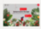
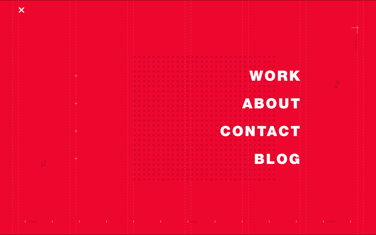
Landing Page
+
So far this was the final landing page screen for Ampersand Design with the logo text, navigation icons. Yet the depth in the artwork is not achieved.
The team also complained about this kind of landing page especially the marketing team, they thought it was not the right way to attract a client. People might think this to just be a piece of artwork while some might like it and some may not.
They also mentioned this might be appreciated only by the creative people or only by people who belong to the same field like design. Still, the team decided to move ahead with this Idea.
Hamburger Menu Page
+
Single project View
+

Multiple project View
+

Filter Page
+


Filter Page
+

A website is one of the most important marketing and branding vehicles a business can have and it is one of the primary tools that customers and clients (present and potential) will use to either find your contact details or make contact with you.
These were the points that I kept in mind while designing the contact page. Making sure the look and feel of the Contact Us page was according to the brand.
• Show People How to Find You
• Include a Contact Form for Ease of Communication
• Use a Grid for Layout
• Make It User-Friendly
• Show Off Social Media Links
• Be Friendly and Helpful
Project Preview
+
This page gives the viewer an overview of a particular project displayed by the studio. For this page, we decided to structure it in a systematic way, so when the user lands on the page it gives them a brief about the project with information of the client and the people who have worked on it. On scrolling down, the page shows the first introduction image to the project with radial dot marks on the right, along with number dots that represent the number of images used to define the project; it can be anything- text, mockups, videos, etc. These dots also work as CTA (call to action buttons). When you click on them they will guide the user to a particular number of the image.
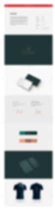
These are few project pages designed for the Ampersand website.
Scroll Down
